
Carry Bags
Coles Local, Adelaide St

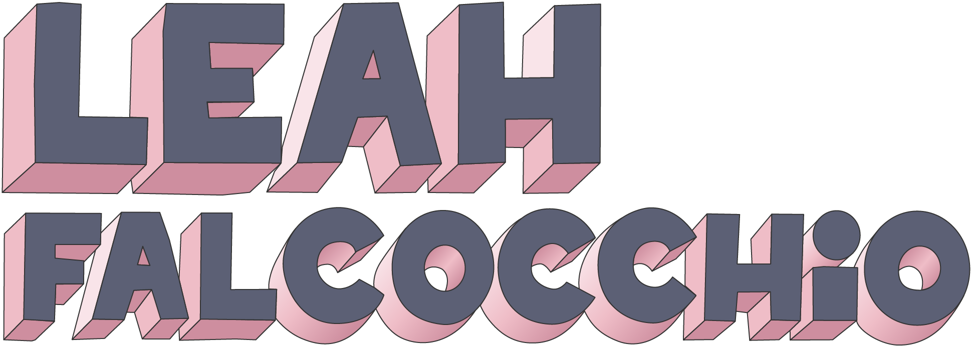
Oddly enough, the first thing that had to be designed as part of the store mural process was the signature carry bags. This is because they had a long lead time on production, so my challenge was to create art knowing that whatever concept was approved, it was going to have to match with the murals - murals that I hadn’t fully visualised yet.

As is usual for my process, the block lettering concept was strong in my mind. You can see from the earliest version of the art that the shape of the letters is much the same as what eventuated.
Having only recently discovered Procreate, I toyed with concepts using illustrations that gave the feel of being hand painted. Truthfully though, I didn’t want to wrap my head around how to make bitmap art look good at a large scale when I could just draw everything in vector and know that it will enlarge well.


The first is the concept that we ran with, and it ended up informing my eventual use of colour nicely. Pink and blue are my two favourite colours, so in my mind there was never another option for the colours of the lettering. Anyone familiar with my list of favourite colours will know that green doesn’t ever feature, but it turns out I don’t actually mind that green gradient in the second option!


